Case study 1
Website redesign
TPG Telecom
A post-merger website assembled under pressure, inconsistent, unbranded and with no design foundation to build from.
Role
Sole UX/UI Designer
Team
Digital Lead, Developers, Marketing, Product Managers
Timeline
Feb 2024 – Mar 2025
When TPG Telecom and Vodafone merged in 2020, the corporate website was assembled quickly. Two years later it showed. Branding was borrowed from Vodafone. Icons were inconsistent. The information architecture was unclear. Lead generation forms appeared differently across pages. There was no design system and no source of truth for the development team.
A full rebrand was already in discussion externally. The digital team had a new website to build. There was one designer.
Building the foundation first
The design system nobody asked for.
And everyone needed.
My first move was to make the case for a design system before any redesign work began. This was not part of the brief.
The Digital Lead approved it. I presented the case to the wider marketing and digital team, covering Atomic Design principles, UI foundation approach and WCAG accessibility considerations. Without a tokenised foundation, every design decision would be made in isolation and the rebrand already in progress externally would require reworking everything from scratch.
I built the system in sequence. UI foundations first with a WCAG-accessible colour palette, typography, spacing and grid. Then tokenisation. Then the icon strategy, using Phosphor Icons as the base set with bespoke TPG product and value proposition icons designed from scratch.
Every component was built to Atomic Design principles within the hard constraints of Drupal CMS. When the marketing team pushed back on gradient card states, I did not compromise to a lesser treatment. I removed the state styling entirely. A clean result was better than an inconsistent one.
UI foundation - WCAG-accessible colour palette and typography
Bespoke product-related icons
Atomic Design structure
Redesigning the website
50+ pages, multiple business units, 7 phased rollouts, one designer.
With the system in place, the redesign covered the full site in seven phased rollouts. Homepage, landing pages, solution and product pages, navigation and footer.
The mobile plans pages previously existed as three separate pages: enterprise, government and small business. I kept the header, bottom content and lead generation form consistent across all segments and used a tab system to separate the product offerings. It had not been done on the platform before. It went live.
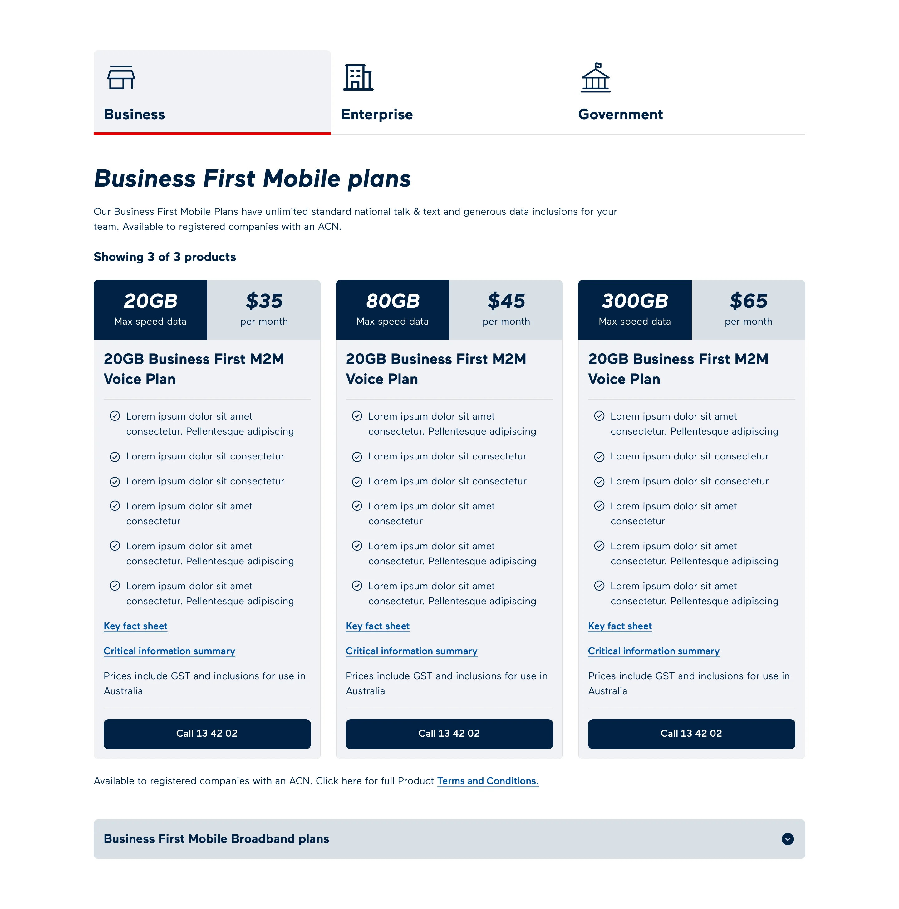
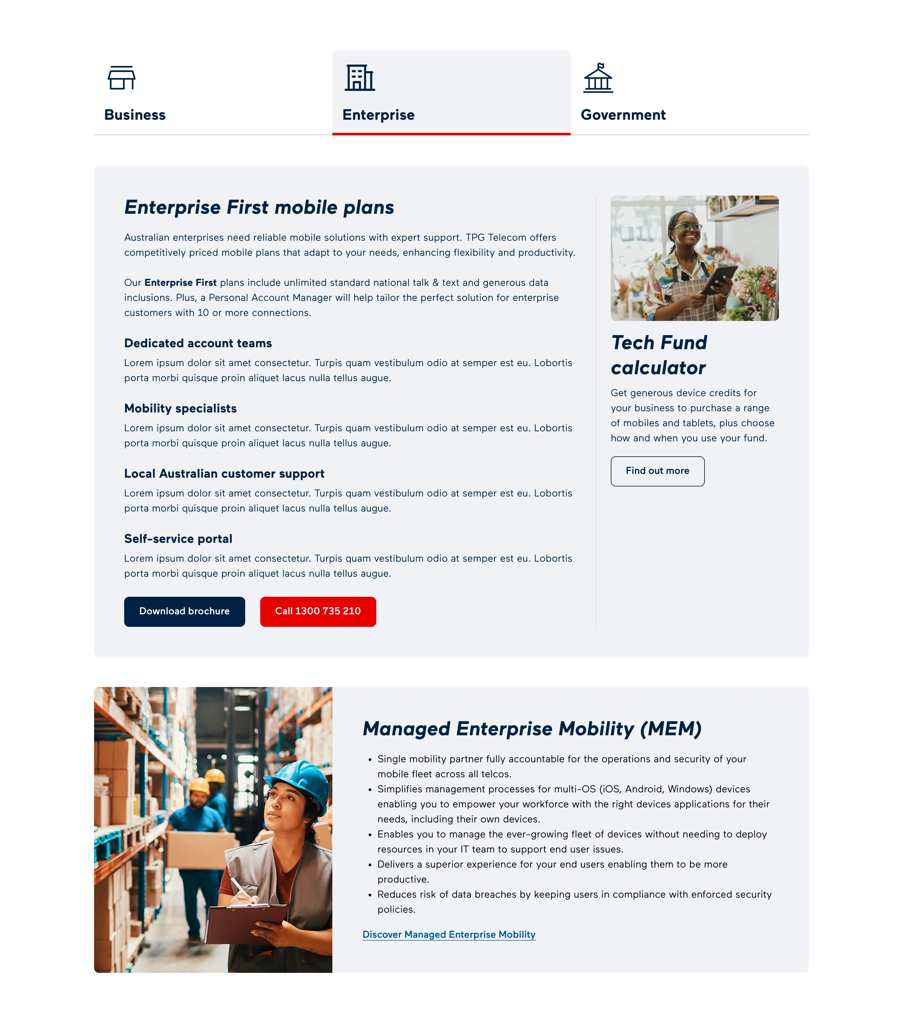
Consolidated tab navigation across customer segments
On the NBN product page, the General Manager pushed to include service qualification so customers could confirm availability before committing to an enquiry. The business case was clear. I implemented the field within the existing constraint and matched the visual treatment to the redesigned site. About a year later I designed the fuller solution. A dynamic result page returning all qualifying services in a single view, grouped by product category.
Initial implementation
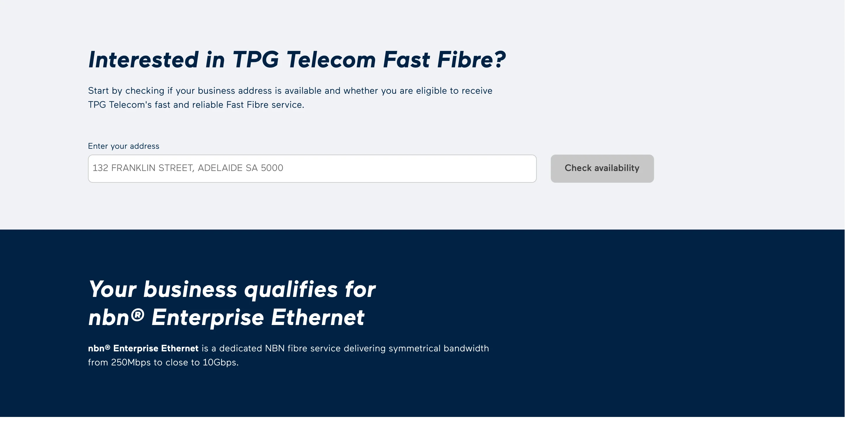
Final solution
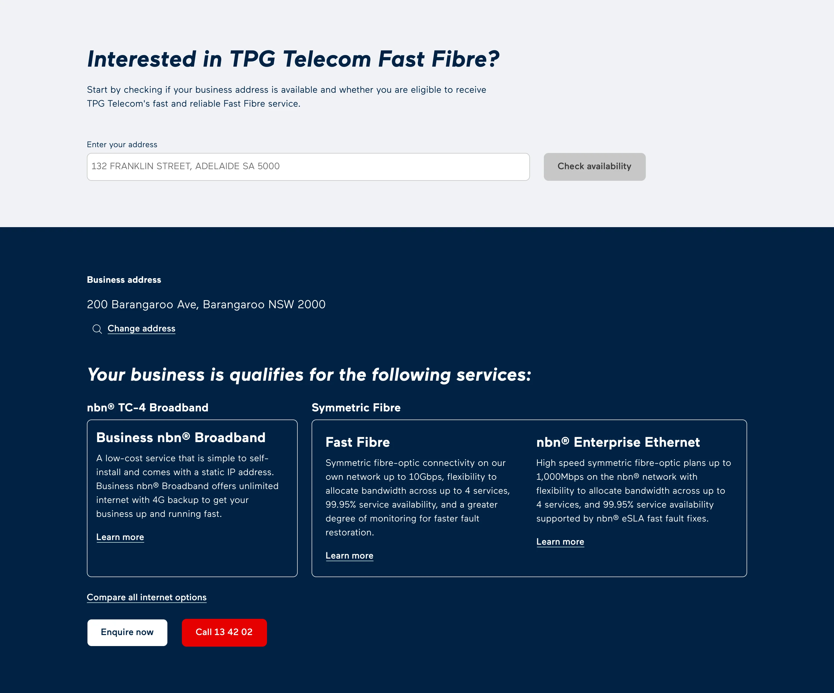
SQ results - initial to final solution
I added a recommended products section at the bottom of each product page. Previously a user who reached the end of a page had no pathway forward. The product cards gave prospective customers a reason to continue exploring rather than drop off.
Research nobody asked for. Insights that surprised
the room.
The wholesale discovery was self-initiated, separate from the core project. After the AAPT acquisition, the merged TPG website had no wholesale presence. I spoke with four to five account managers, gathered what their customers actually needed and presented the findings to the wider team. Some insights surprised the room. A business restructure reduced the output to a single landing page but the research and the initiative were entirely my own.
Wholesale landing page
Before
After
Homepage - before and after
Lead generation optimisation
Inconsistent forms. One seamless lead experience.
The lead generation experience had been one of the most fragmented parts of the original site. I approached the optimisation in two rounds.
The first round made the form sticky at the bottom of product pages. A two-column layout with a call CTA on the left and the lead gen form on the right kept the lead pathway visible regardless of where the user was on the page.
The second round was structural. I removed fields confirmed as unnecessary by customer managers and reorganised the rest logically. My preferred post-submission approach was a dynamic in-form confirmation. Salesforce could not pass the required data back. I kept the separate confirmation page, redesigned it and rewrote the copy so users knew a sales team member would follow up.
Neither the sticky form nor the call CTA was driven by prior analytics data. They were design decisions based on what was clearly absent. The connection to the conversion improvements was made retrospectively through GA4 after launch.
Before
After
Lead gen form: before and after
Outcome
Conversions grew. Even as traffic declined.
The metrics below reflect post-launch performance. Site traffic declined approximately 13% over the same period, a known factor in the broader business context. Conversions grew despite this.
+65%
Monthly leads
461 to 761
~50%
Form submissions
187 to 280 per month
2X
Visitor conversion rate
0.52% to 1.01%
80%+
Campaign page design time
3-4 weeks to 2 days
More projects
Arup
Scenario planning tool
A specialist planning process running across disconnected tools, documents and regional teams.
Arup
Product validation
A product with significant investment behind it and no clear case to continue.